Pitch Deck Teardown: Scrintal’s $1M seed deck
There’s no shortage of tools for brainstorming, collaboration and keeping all your knowledge in one place. Still, judging from the number of new tools that come to market on a regular basis, it seems that people are frustrated with the available tools.
Scrintal recently raised $1 million to build its visual collaborative knowledge base tool and shared its deck for us to take a peek under the hood.
We’re looking for more unique pitch decks to tear down, so if you want to submit your own, here’s how you can do that.
Slides in this deck
- Cover slide
- Problem slide part 1
- Problem slide part 2
- Solution slide part 1
- Solution slide part 2
- Value proposition slide
- User testimonials slide
- Traction slide
- Revenue slide
- Retention slide
- User profile slide
- Growth projection slide
- Vision slide
- The ask slide
- Contact slide
- Appendices cover slide
- Appendix 1: Why now?
- Appendix 2: Competitive landscape
- Appendix 3: Product and growth model
Three things to love
Scrintal is entering a crowded and chaotic market; without really trying, I can name five or six well-established competitors in that space. The good news is that the company seems to know that and tackles its advantages head-on.
Clarity of value proposition

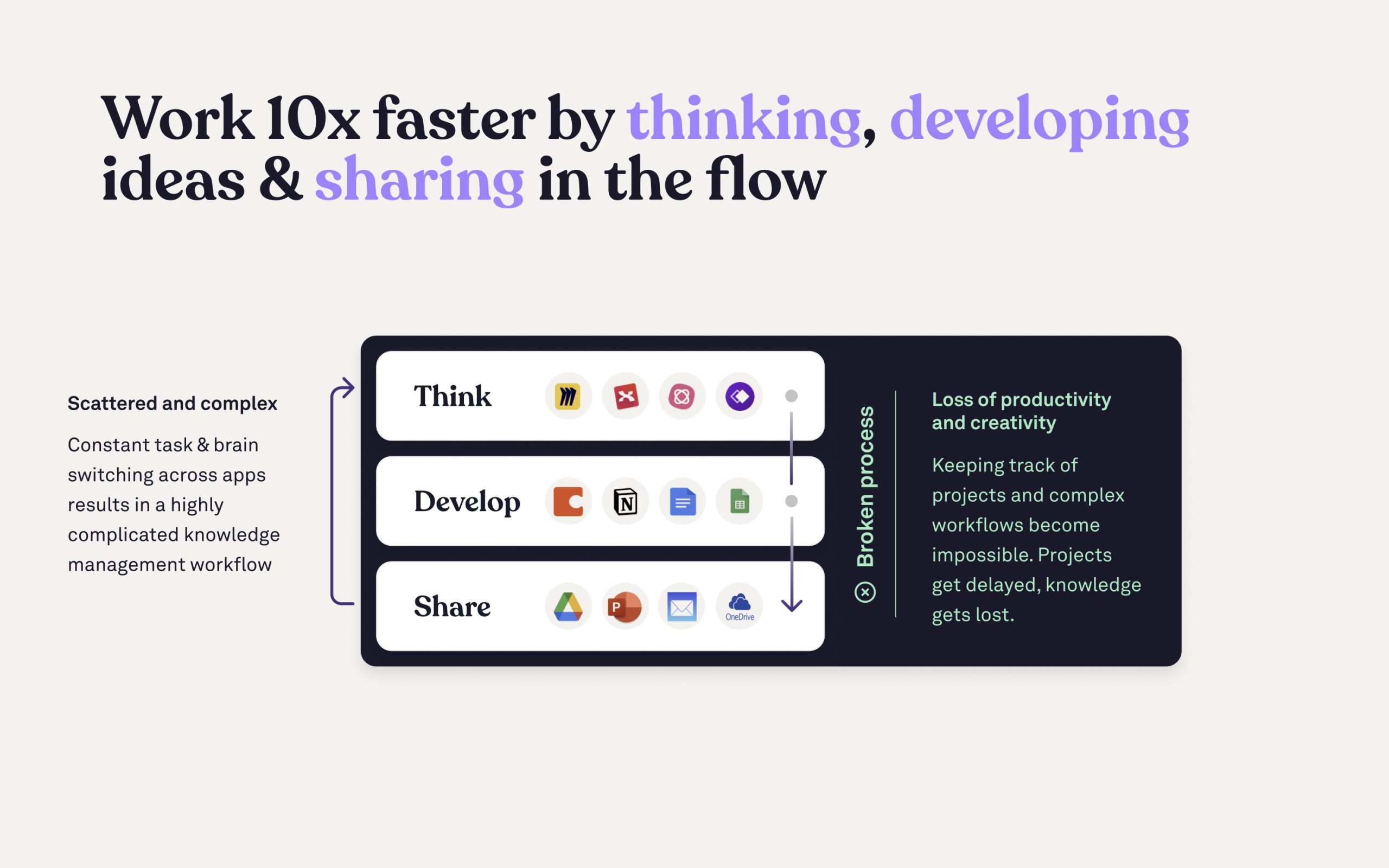
[Slide 6] Having a clear value prop helps tell the story. Image Credits: Scrintal
Promising a 10x increase in work speed is a hell of a claim, and as a would-be investor I’d want to see some proof — but the story is told very well. This value proposition slide comes after a pretty thorough examination of the problem space and the solution the company is building, and puts great clarity around what the tool does and who it does it for.
Storytelling to explain the benefits

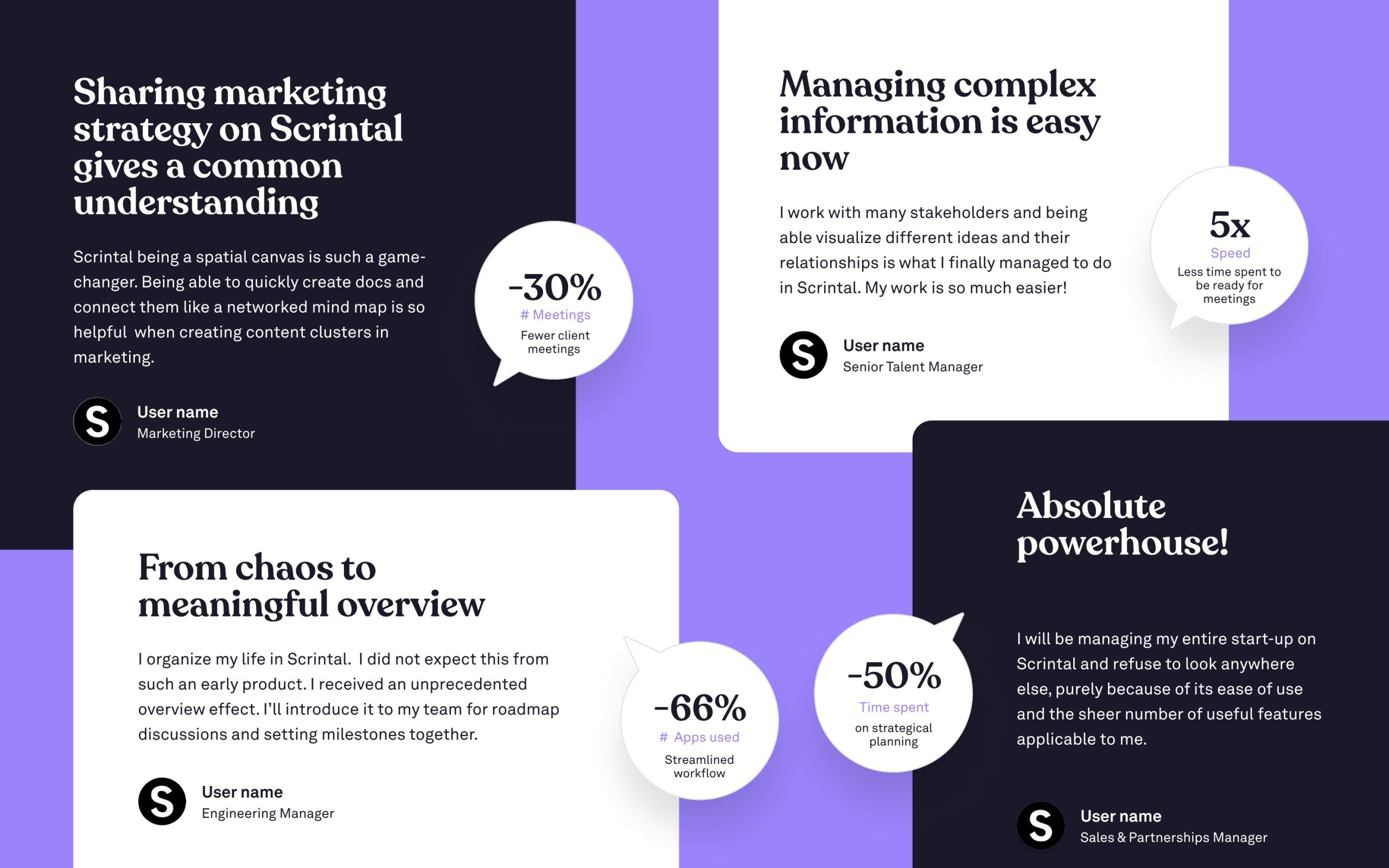
[Slide 7] Scrintal does a great job at making its early customers do the bulk of the storytelling. Image Credits: Scrintal
Getting your users to tell your story for you is such an obvious storytelling technique, often used in sales decks. It’s remarkably rarely used in VC pitch decks, which I think is a tremendous shame. Here, Scrintal is using its customer testimonials to highlight various selling points and benefits in a way that feels seamless and elegant.
The stats shown on the slide (66% fewer apps used, 50% less time spent, 30% fewer meetings) tell one part of the story. The headlines tell another. The quotes are helpful for filling out the story even further, and even doing a quick skim of the job titles of the people sharing the testimonials helps give an impression of the breadth of how the companies are able to draw benefits from Scrintal.
I presume that the places it says “user name” are redacted and that the “real” deck shows the names and businesses that are using the product, but even without that, it shows how well you can use testimonials and user interviews to your favor.
For startups, this slide is a lesson in how to think creatively about sharing your journey to date with potential investors.
I’m not in love with how much text there is on this slide — you wouldn’t want to use this for a presentation deck — but it’s a great slide for a send-home deck. It adds a lot of context and does so in a way that is super easy to understand even without a voice-over or additional information.
A bold vision

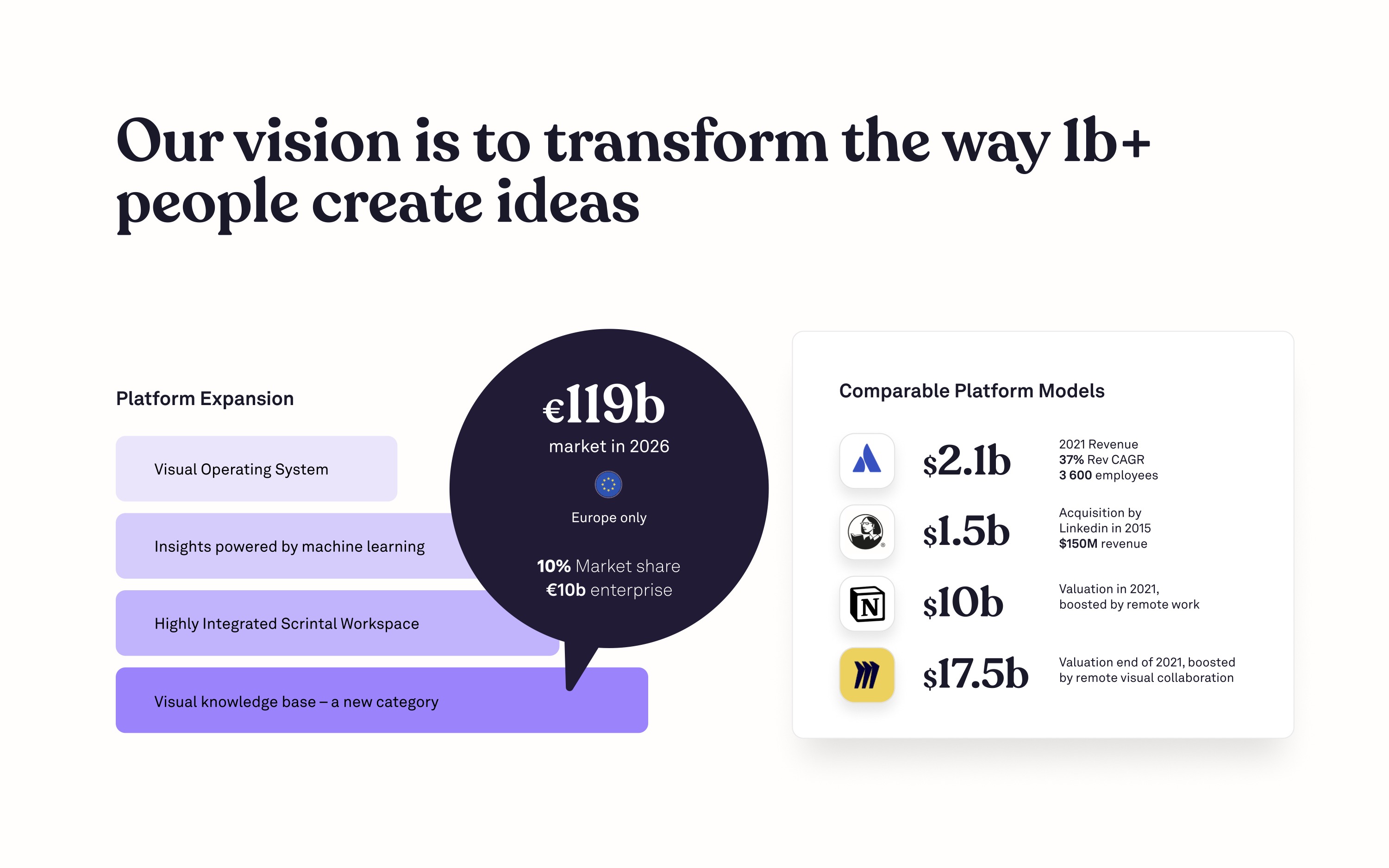
[Slide 13] Including a clear vision for the near future is helpful. Image Credits: Scrintal
(opens in a new window)
This slide isn’t strictly a vision slide — it does a lot more than that. It shows off what some of the competitor valuations are and explores the nature of the business models of those competitors. It shares the trajectory of its plan (although the step functions from visual OS to machine learning to workspace to visual knowledge base are a little unclear to me). Having said that, in a pitch context, I can see this being a helpful slide to guide some of the conversations with the investors in the right direction.
This slide isn’t a complete slam dunk, however, and there are a few things that could be improved. I wish the vision was clearer: “transform the way 1B+ people create ideas” is pretty fluffy. Yes, the company wants to transform it, but from what to what, and why? It’s also a little confusing to me why the company is talking about the European market only — it’s a big world out there, and the company’s pricing is in U.S. dollars, so seeing the “platform expansion” limit itself is confusing.
In the rest of this teardown, we’ll take a look at three things Scrintal could have improved or done differently, along with its full pitch deck!
Three things that could be improved
One of the big things investors are looking for when evaluating a startup is whether it is able to gradually de-risk what it is doing, stage by stage. A million dollars isn’t a huge fundraising round by most standards, and the company is likely at the earliest stages of its value-creation journey. That means that the deck needs to make something pretty clear: What is it doing in the current stage to prove some of its hypotheses? Sadly, the Scrintal deck is a little lacking on that front.

