Spotify Is Giving Its Home Screen a Makeover - CNET
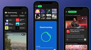
Spotify is revamping its home screen to make it easier to find new content, adding video and audio previews for music, podcasts and audiobooks.
The app’s layout is also moving away from a grid of album covers, in favor of an infinite scroll akin to a TikTok feed.
“You’ll see Spotify, I think, come alive,” Spotify founder Daniel Ek told CBS. “You’re gonna see a lot more interactive content.”
The company announced the makeover on Wednesday at its Stream On event, along with new tools for podcasters and ways for musicians to further interact with their fans.
The Spotify home screen will now offer a stream of previews of music, shows, podcasts, audiobooks and other content that users can save, share or explore, as well as new video feeds for discovery in the Search section.
In addition, the Enhance tool has been rebranded as “Smart Shuffle” and will reorder user-generated playlists and suggest related tracks.
“The most important thing we, at Spotify, can do for creators is to reduce the distance between their art and the people who love it — or who would love it as soon as they discovered it,” Spotify co-president Gustav Söderström said in a release.
Some of the new features are already live on the Spotify app, the company said, while others will roll out in the coming months.
In February, Spotify beta-launched DJ, an AI-driven music guide made available to premium users in the US and Canada.
Spotify also announced on Wednesday that it had passed 500 million active users a month.


