How to use desktop widgets in macOS Sonoma
Apple’s updated widgets in macOS Sonoma are not only now available on the desktop, they’re also interactive instead of solely displaying information. Here’s how to use them.
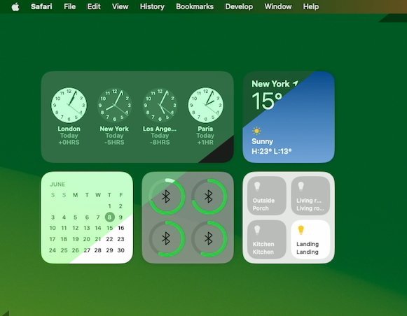
Apple made a headline feature out of the fact that you can now take a widget — an app’s small information window — and place it anywhere on the desktop. Previously widgets lived only in a sidebar that you had to drag in from the right of the screen.
As useful as those widgets could be, the fact is that they were a drag in more than one sense. You had to remember that they existed, then either swipe just so with your fingers on a trackpad, or click on the date in your Mac’s menu bar.
So Apple was right that the new system of having them permanently visible is significant.
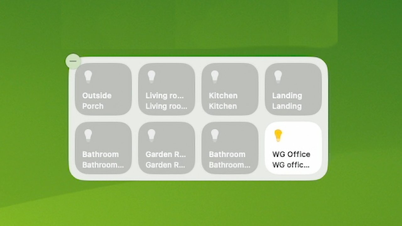
But it’s the interactivity that nails it. Instead of only being able to see, say, the status of lights in your Home app’s widget, you can now turn them on or off, right there.
Interactive widgets are going to take a time to become commonplace, as developers have to work on updates, though. And right away in macOS Sonoma, you can immediately place, use, and replace desktop widgets.
How to use desktop widgets in macOS Sonoma
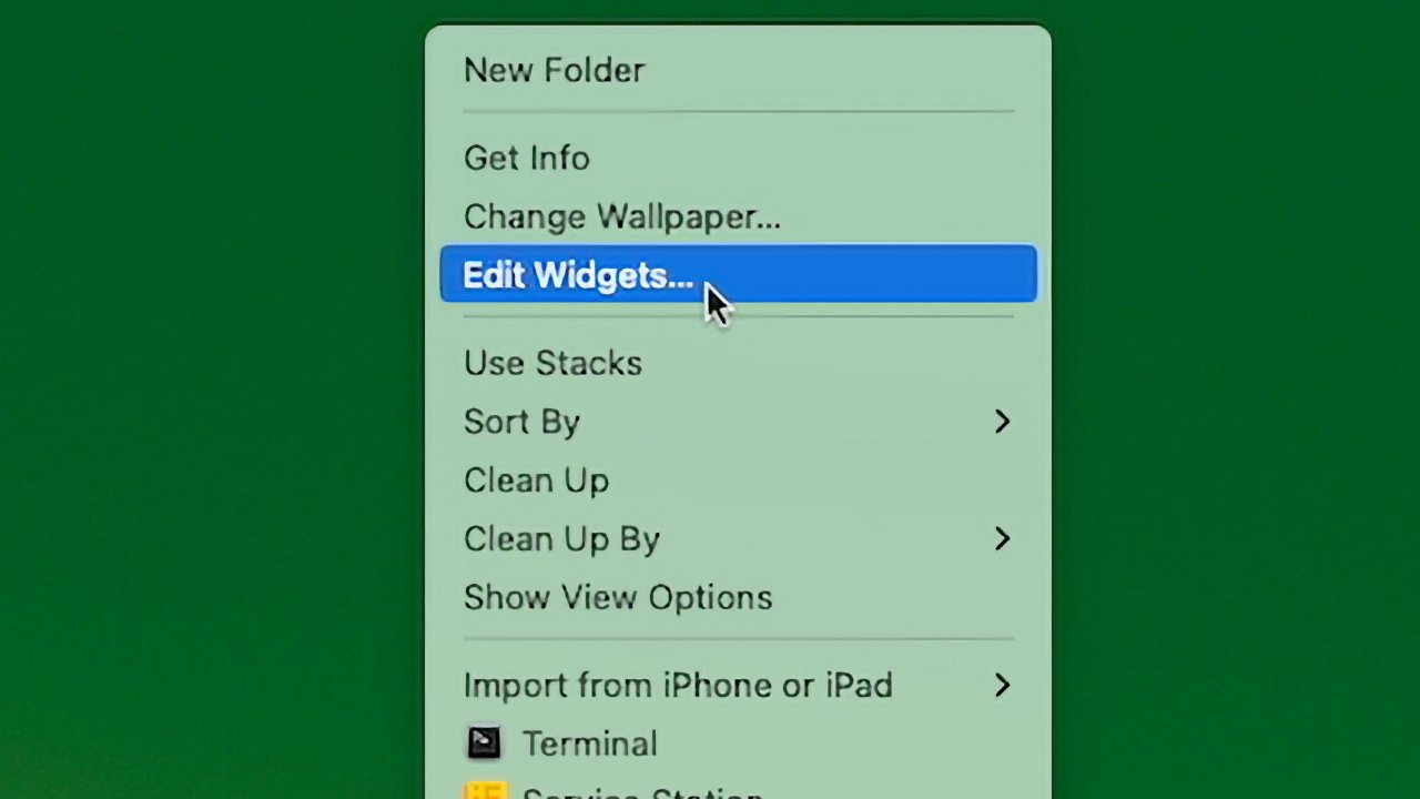
To get started, right click on any empty space on the desktop.
- From the menu that appears, click on Edit Widget
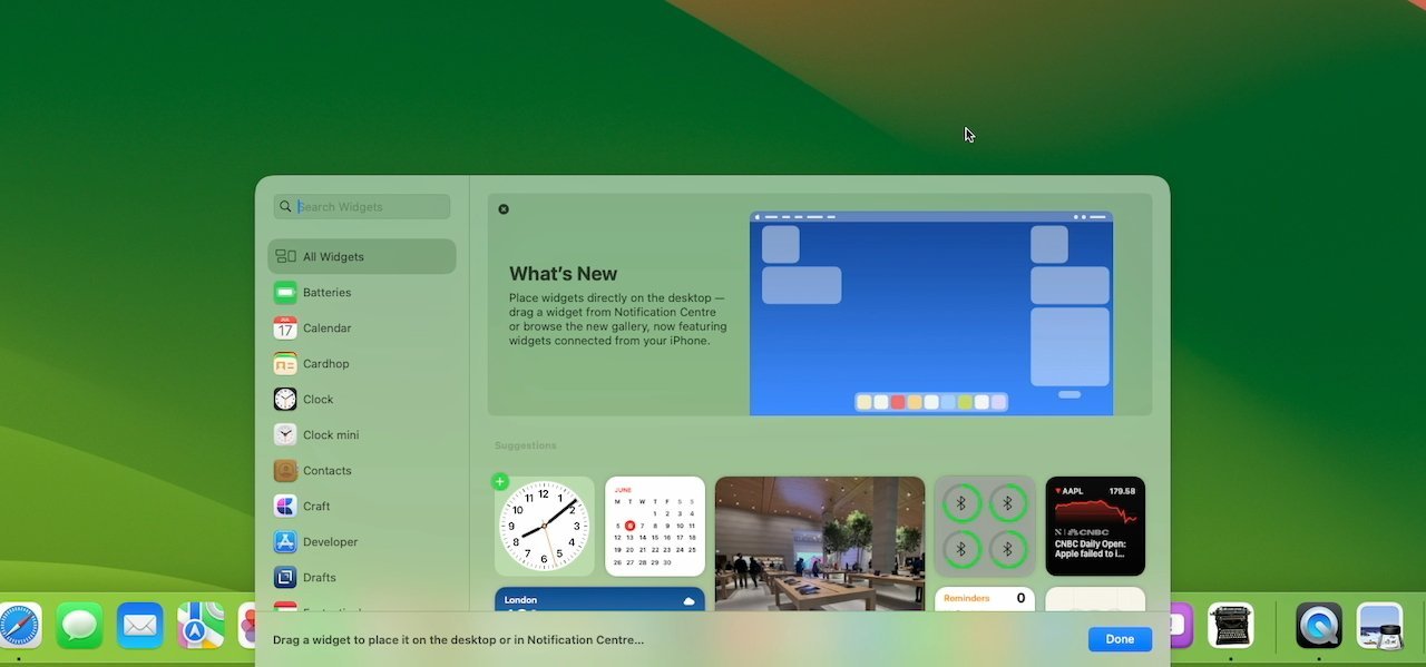
- From the pop widget picker that appears, scroll or search for one
- Click on a widget and choose from the sizes and types offered
- Drag that widget to anywhere on the desktop
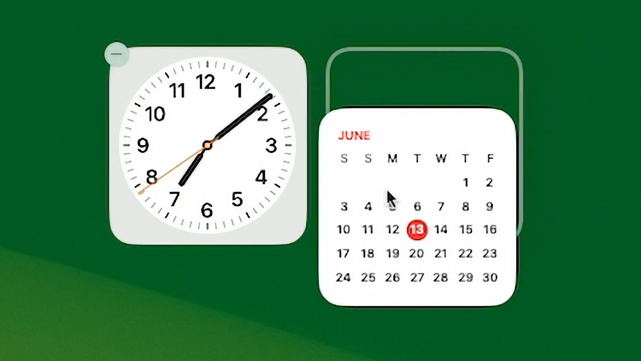
The first time you do this, you can place the widget at absolutely any spot on the screen. That’s also true with a second or subsequent widget, but there is a small difference.
As you drag a second widget toward where you’ve placed the first one, Apple offers some help. A white widget-shaped outline appears where Apple suggests you place it.
That suggestion will change as you drag. The outline will appear to the side, above or below the first widget, aesthetically arranged to be in just the right position, and with just the right gap between the widgets.
If you want to place it where Apple suggests, the widget will snap into position.
The old widgets are still available
Apple’s new system is an addition to the previous widgets, not a replacement. So the existing sidebar that used to be the only place you could have widgets, is still available — with one small change.
You still call it by swiping the right spot on a trackpad, or by clicking the date in the top right of your menu bar. When you do that, the sidebar appears and, alongside recent notifications, shows any widgets you have chosen.
What’s new is that if you choose, you can click on any of those widgets and drag them out to the desktop. Note that you really are dragging it out of the sidebar and will have to add it back in later if you want to.
Now iPhone widgets are available too
Widgets come with apps. If you haven’t got the app, you can’t have the widget — except in one specific, new situation.
Under macOS Sonoma, you can install a widget without having the Mac app — if you have the iPhone one. Assuming you have the iPhone app, and that you are signed in to the same Apple ID on both that and the Mac, you can use iOS widgets on macOS Sonoma.
You need to bring your iPhone close to the Mac to start. But then when you have, your iPhone-only widgets are available on macOS Sonoma.
Using the new interactive widgets
Once macOS Sonoma is officially released, developers will have had time to add interactivity to widgets — where appropriate.
Up until now, a widget could display information, such as the weather, news headlines, or the status of HomeKit devices. It was possible to click on them, but in every case, widgets would just launch their main app.
That is still what happens, unless you click in just the right spot. In Apple’s Home widget for instance, you can now click on a button and turn a light on or off.
You can turn on that light, and the Home widget’s buttons will show you that you have, but you won’t have had to go into the full Home app.
Changing and deleting widgets
Most widgets offer at least some customizability, and you can check that out by right-clicking on them. If there are options, the widget will display them.
If you decide you don’t want a widget where it is now, you can drag it somewhere else.
Then if you really just want to be rid of a widget, you have two options. You can hover over the widget, right click and then choose Remove Widget from the menu.
Or if you right-click on any empty part of the desktop, you can choose Edit Widgets. This is just as you did for when you first added a widget, but now any that you have will gain a delete icon in their top left corner.
It’s a significant update to widgets
Apart from the interactivity, there isn’t a visual change to widgets with macOS Sonoma. There are not, as yet, any new sizes or arrangements of features in a widget.
But being interactive is huge. And being able to place them on the desktop, where you can always see them, will transform how you use widgets.


