WatchOS 10's Widgets Will Change How You Use Your Apple Watch - CNET
The way you interact with apps on the Apple Watch hasn’t changed much since its 2015 debut. While the Apple Watch has gotten faster, bigger, more polished and better at health tracking, navigation is still tedious. The Digital Crown can make navigation feel more natural since you’re not obscuring the display with your finger, but finding the app you need can still be a burden if you have a long list to scroll through.
But WatchOS 10, which launches this fall and is now available in public beta, introduces another solution: widgets. These tiny information cards make it easier to get things done without having to dig through apps.
Widgets aren’t new for Apple; they’re on the iPhone, iPad and Mac. But they really shine on the Apple Watch since tapping and swiping multiple times on such a small screen is a less-than-ideal experience. I’ve been using the WatchOS 10 public beta for a short time, and already enjoy using widgets to set alarms, check reminders and see whether it’s going to rain just by twisting the Digital Crown.
As a longtime Apple Watch user that has reviewed, tested or otherwise evaluated most of the company’s watch models over the last seven years, this feels like a step in the right direction. The new widget-centric approach is more in line with how I actually use the Apple Watch: To accomplish certain actions (like setting a timer, paying for a subway ride or starting a workout) rather than seeking out specific apps.
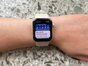
Widgets are literally just a swipe away in WatchOS 10. You can either swipe up from your main clock face or twist the Digital Crown to access them. You can edit and change your widgets with that familiar gesture of pressing and holding on the widget screen.
Right now, I have widgets for reminders, my activity progress, news headlines, the weather and — my personal favorite — complications. You can fit three complications on this widget, essentially allowing you to pin three apps right below the main clock face. This is where I put my second-tier Apple Watch apps, or the ones I use daily but not multiple times daily. My essentials are situated right on my clock face, but having these other frequently used actions just a swipe or scroll away has been helpful.
You can combine widgets and complications to get multiple bits of information from the same app without much effort. For example, the large weather complication that shows an hourly breakdown of the temperature, along with today’s highs and lows, sits on my main watch face. But if I want to take a closer look at the chance of rain throughout the day, I can just scroll to the rain weather widget in my widget stack.
It’s not the first time Apple has tried to make it easier to see information on the Apple Watch without launching an app. Remember Glances? That feature also allowed you to view things like your next calendar appointment, battery level and the weather just by swiping up from the home screen.
WatchOS 10’s widgets feel like an evolution of this idea. They’re more polished than Glances, their look and layout is more consistent with the widgets found on other Apple devices. And since they appear in a feed rather than occupying the entire screen, like Glances, you can see more data at (you guessed it) a glance.
The widgets in WatchOS 10 reflect the ways people use the Apple Watch most frequently. And it’s notable that they make their debut roughly eight years after the first model went on sale. While it may not sound like a monumental change, it’s one that I think will make the Apple Watch more convenient.

