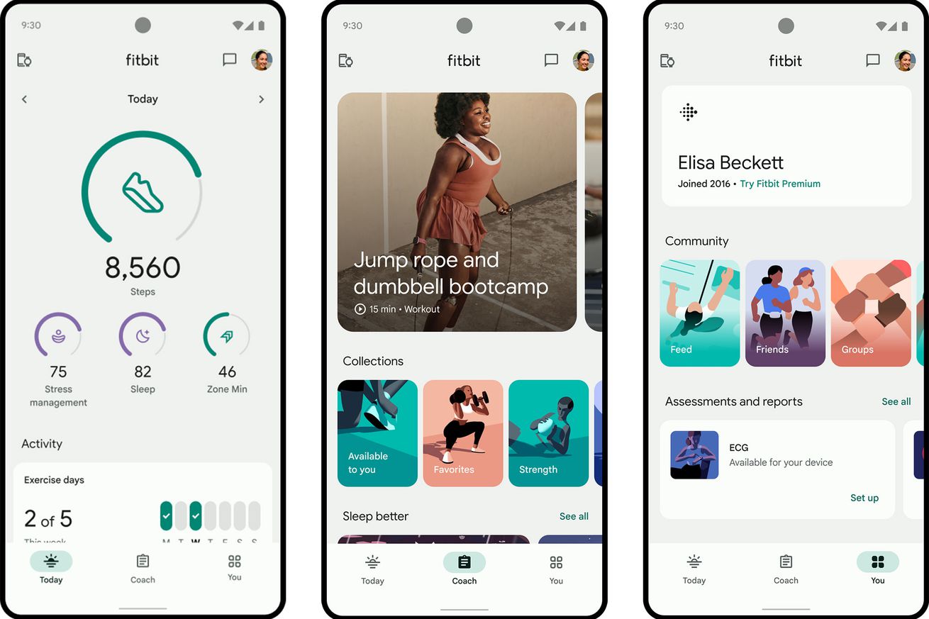
The Fitbit app is getting a streamlined new look this fall
Fitbit’s been going through a lot of changes over the past year — and it looks like that’s only going to continue. The Google-owned app is getting a total redesign this fall, and select Fitbit users may see an invite to try a beta version starting today.
For starters, Fitbit is reorganizing how it presents your data. Going forward, the app will be divided into three tabs: Today, Coach, and You. The Today tab isn’t changing too drastically from what it is now, but the main metrics you see up top can be customized to highlight different focus areas. For example, if you want to sleep better, you’ll see your Sleep, steps, mindfulness, and Zone Minutes first thing. If your goal is to improve your heart health, the app will instead emphasize your heart, health metrics, Zone minutes, and exercise. You’ve always been able to customize what you see up top; now, Fitbit provides some custom presets for common goals. In its press release, Fitbit also says the new tab will feature “more consistent charts, graphics, and icons that show your health trends.”
The Coach tab is where content will live, like curated workouts or mindfulness sessions. Some of these will be available to free users, while others, like HIIT and dance cardio classes, will be exclusive to Fitbit Premium subscribers. The tab will also get filters that let you sort classes more easily (e.g., by time, required equipment, etc.)
The You tab is perhaps the most unfamiliar of the bunch. From a demo video, it appears that this is where you’ll be able to adjust personal settings, such as daily steps, bedtime, active zone minutes, etc. It’s also where you can view newly redesigned achievement badges. Fitbit says this is also where you can “manage community connections,” but it’s unclear what social features the redesigned app will have after Challenges were discontinued earlier this year.
It’s hard to see from official renders, but Fitbit says that it’ll be easier to log things like steps, exercise, and water intake — regardless of whether you have a Fitbit device. Otherwise, the look of the app has also been refreshed with a new color palette and updated photography, icons, and illustrations to match Google’s Material Design standards. From the official screenshots, it’s got a similar vibe to the Pixel Watch 2 watchfaces that leaked over the weekend. You could say the redesign finally makes it clear that Google owns Fitbit now.
None of this should come as surprising if you’ve been paying attention to the Android wearable space as of late. As mentioned, Fitbit ended its legacy Challenges and social features in March, angering several longtime users. Soon after, Google announced it would start the migration process from Fitbit to Google Accounts this summer. In May, Google announced Wear OS 4 at its annual I/O conference, and later this month, we’ll get to see how the new platform functions on the Samsung Galaxy Watch 6 series. Along the way, Google’s released a smattering of minor Wear OS and Fitbit updates.
It’s clear from this timeline that Google is laying the groundwork for the Pixel Watch 2, which is expected to launch later this fall alongside the Pixel 8. So far, we haven’t heard much about the second-gen smartwatch, though rumor has it Google will add a continuous electrodermal activity sensor and ditch Samsung’s processor for the new Qualcomm Snapdragon W5 Plus platform. When the Pixel Watch initially launched, there was understandable skepticism about whether Google would commit to its renewed wearables push. This, along with other efforts to further integrate Fitbit into the Google fold, seems to indicate that the Pixel Watch (and Fitbit) will be spared from Google’s graveyard. At least for now.

