Get ready for a repositioned end call button in iOS 17
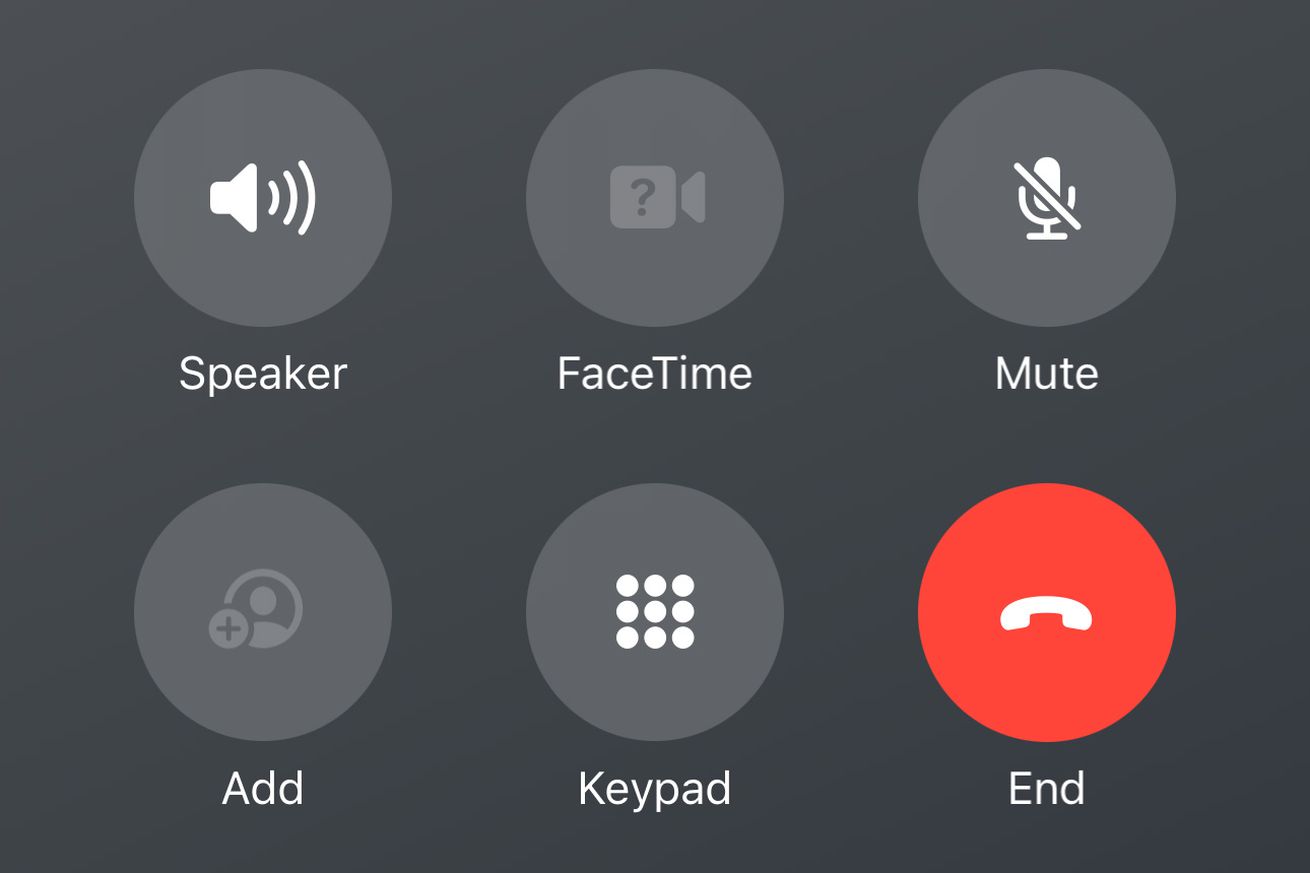
Apple looks set to be moving one of the most well-used buttons in iOS; the Phone app’s red end call button. Beta versions of iOS 17, which will likely get an official release this fall alongside the forthcoming iPhone 15, feature a redesigned call interface that shifts the red button down and to the right, and eliminates the distance between it and the rest of the call controls.
The new interface was technically made available with the very first developer beta of iOS 17, but it hadn’t been widely spotted until this week when the likes of CNBC and Gizmodo covered the change. Here’s a before and after comparison of the call interface between iOS 16 and beta iOS 17:
To me, it looks like Apple has made the change to account for iOS 17’s new Contact Poster feature, which replaces a large part of the phone call interface with an image that represents the person you’re speaking to (as you can see in the image above). Rather than having this image be covered with buttons and icons, Apple appears to have shifted its call controls down to allow the poster itself to be center stage.
Personally I think the change makes sense, but others are making the argument that this could mess with years of built-up muscle memory and result in people activating FaceTime when they actually want to hang up. But there’s always a chance that the design gets tweaked before iOS 17 exits beta later this year, like how Apple endlessly fiddled with the redesigned URL bar in Safari in iOS 15 before eventually giving users an easy way to swap it back if they didn’t like its new location.

