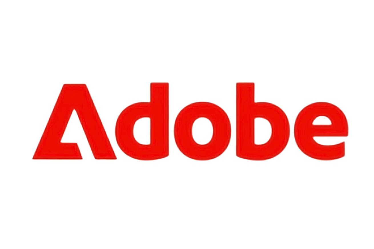
This is not Adobe’s new logo
Adobe has started using some new branding across the most recent promotional videos for its generative AI apps. The new branding combines the current Adobe corporate mark (the triangular “A” logo) with the company’s Adobe Clean typeface (which is used in the software giant’s current logo) to spell out the name Adobe. You’d be forgiven for assuming this was an update to the logo introduced in 2020, but according to Adobe, this “wordmark” isn’t replacing the official logo that the company currently uses.
“It’s not replacing the logo; it’s just a new expression in the way that we are creating the way our brand shows up in the world,” Adobe’s head of brand strategy, Heather Combs, said to Fast Company. ”We’ve had a logo for a long time. A beautiful logo, which is still our logo moving forward. We’ve just added a new piece to the tool kit so we can express the brand in multiple ways.”
The actual terminology here is kinda interchangeable. Combs is talking about the “A” design element — which was created by Marva Warnock, the wife of Adobe co-founder John Warnock, back in 1982 — as the “logo” in that quote. But it’s also just one of the two elements that form the company’s official logo, the other being a typeface that spells out Adobe’s name. And the presentation used for the name has changed a few times: between 1982-1993, the text just spelled out the remaining “dobe,” though this eventually changed to include the corporate “A” mark and the full Adobe name.
If anything, this new wordmark just highlights how redundant the current logo is. Does it really need that additional “A”? And if both the corporate mark and the full with-text logo can both be interchangeably used as, well, Adobe’s logo, then why can’t the wordmark? Even Combs acknowledged that the wordmark gives Adobe “a bit more of a compact way to express the brand.” The changes aren't even that significant — the redundant “a” has been removed, the typeface has been fattened up a little, and the colors of the triangular “A” logo have been flipped to match the text. It looks far more compact and modern than the logo introduced in 2020.
The wordmark’s appearance alongside materials promoting Adobe’s generative AI tools suggests we might be seeing a lot more of it in the future. Combs declined Fast Company’s request to confirm if this was being used as a mascot of sorts for its AI products but admits that they at least partly inspired the company to jazz things up. “With what we were doing around generative AI and Firefly, we wanted to be more on the edge. And I think we see the wordmark as being a very fresh, bold kind of way to express the brand,” she said.
Adobe isn’t currently planning to update its current logo to the new wordmark any time soon, but that doesn’t mean that future changes are unwelcome — so long as they remain true to the company’s history. “Our corporate mark is widely recognized. It is something a lot of people see and feel very positive things about,” said Combs. “And I want to continue to sort of build off of that.”

