Chasing rainbows
Living with colorblindness feels like you’re constantly being pranked by the world in subtle, irritating ways.
The other day, I was booking a flight on Kayak, trying to figure out which dates are the cheapest by looking at their low fare calendar. See any issues?
Oh, sorry — that’s what it looks like to me. You probably see it more like this.
I opened up Chrome Dev Tools, changed the cheap fare colors to something I could actually see, and eventually booked my flight. A few weeks later, I’m off to the airport. Conveniently, the parking structure added colored lights to help find empty parking spots. Or so they say? They all look the same to me.
It took me a little longer, but I found a parking spot. Waiting at the gate, maybe I’ll kill some time on my phone. But why is this photo of an ordinary chili pepper at the top of Reddit? Or this leaf? Oh, right.
For some people, colorblindness is a serious liability that closes doors on career dreams. It’s hard to become a pilot, train conductor, or pathologist if you can’t differentiate colors in critical instruments, signals, or tissue samples. For others, it seriously impacts their day-to-day ability to do their jobs, like surveyors spotting flags, doctors looking at skin conditions, or electricians looking for colored wires.
But for me, it’s just a lifelong series of unnecessarily confusing interactions, demonstrating that the world wasn’t designed for people like me.
There are an estimated 350 million colorblind people in the world. About 8 percent of men, roughly 1 in 12, have some form of color vision deficiency. (It’s hereditary, so figures will vary from region to region.) My mom’s color vision is even worse than mine, which is very unusual: only about 0.5 percent of women globally are colorblind, about 1 in 200.
I’ve had a lot of conversations about my colorblindness with people who aren’t colorblind. (Pro tip: when you meet a colorblind person, don’t repeatedly point to things and ask what color they are.) It seems like the very idea of colorblindness is hard for them to visualize.
Despite what many think, I can see most colors! My world isn’t a black-and-white movie. Achromatopsia, or total colorblindness, is much more rare, affecting about 1 in 30,000 people. (Unless you were born on the Pingelap atoll in the South Pacific, where 10 percent of the population have inherited the gene.)
Ninety-nine percent of colorblind people, like me, have a form of red-green colorblindness. I was born with the most common type, deuteranopia, a genetic mutation that affects the ability of the green-sensitive cones in my eyes to absorb light.
As a result, some hues of green and red look like each other, converging on a muddy brown. Other colors, like shades of purple and blue, bright orange and green, or even pink and gray, can look very similar. People with other kinds of colorblindness will confuse different colors.
For example, at a glance, barring other context clues like texture and toppings, avocado toast and peanut butter toast look pretty much the same to me.
Apparently, this is nauseating to people? That’s my life.
Because red and green are complementary colors opposite one another on the color wheel, they’ve become the default colors for every designer who wants to represent opposites: true and false, high and low, stop and go.
Inconveniently, these are also the two colors most likely to be mixed up by people with color vision deficiencies.
I wish every designer in the world understood this and would switch to, say, red and blue for opposing colors. But I know that won’t happen: the cultural meaning is too ingrained.
I’m constantly asked if I’ve tried EnChroma glasses, the corrective glasses made famous in a series of viral videos in which colorblind people try them on and spontaneously start sobbing at the wonder of seeing grass for the first time.
Despite the hype, their corrective lenses don’t actually fix colorblindness. They correct for it by increasing the contrast and saturation of colors, shifting the color palette into something visible, but they can’t help you see colors you’re physically incapable of seeing. As a result, the reviews are wildly uneven, with some people loving them but many people reporting they do little but darken or tint their vision.
And for me, they’re not an option at all. EnChroma offers colorblind glasses with prescription lenses, but my prescription is so strong I can’t use them.
Besides, why do colorblind people have to purchase expensive glasses in order to function in the world when designers could make very minor changes that make a huge difference for a whole lot of people?
That’s the most frustrating thing about these accessibility issues — they’re very much avoidable!
In design, both in the digital and physical worlds, color should never be the sole indicator of meaning. A simple test: if your work was converted to grayscale, would it still be usable?
At the very least, use a tool like ColorBrewer to find a colorblind-safe palette so you don’t end up accidentally designing a map like this, which looks to me like the American Midwest is in the middle of the Purge.
There’s no shortage of colorblindness simulators out there, both free and commercial. They even come built into Google Chrome, Photoshop, Illustrator, and so on. But in my experience, none of them represent my vision exactly. (DaltonLens is the closest.)
These simulators are useful tools, but to rely solely on them is a one-dimensional approach to accessibility. If there’s any uncertainty, adding labels, icons, or textures to each meaningful color of your design will make it accessible to many more people, regardless of their ability to perceive color.
The last time I wrote about my colorblindness was 12 years ago. The good news is that things are getting better. More and more, I’m seeing apps and games add colorblind modes or shift their palettes to be more friendly to the colorblind.
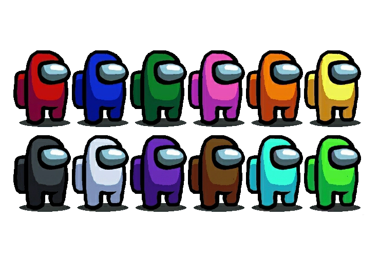
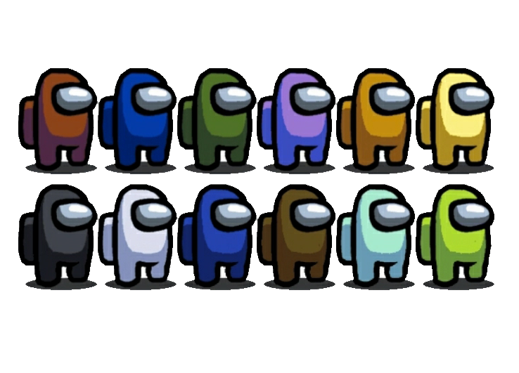
When Among Us launched in 2018, it was incredibly difficult for the colorblind to play. Every character model looks the same, distinguished only by color. Players would use the colors to identify other players in the voice chat. “Green is sus,” someone might say — but which one is green?
“Green is sus,” someone might say — but which one is green?
Plus, the game’s wiring tasks, in which players have to reconnect wires of the same color to their corresponding terminals, required normal color vision to finish. For me, it was just trial and error. I felt excluded from the moment I started playing.
It took years of complaints before the developers added symbols to the colored wires in late 2020. An update in June 2022 finally offered the option to display color names on characters.
Contrast that with Wordle, the viral sensation created by Josh Wardle as a love letter to his partner, which launched in 2021. The game shipped with a colorblind mode on day one. The default colors are very hard for me to see, but the colorblind support made it immediately accessible.
I asked Wardle what inspired him to add the feature. “I think it felt like a simple thing to do to make more people feel included,” he replied, but he quickly acknowledged he could have done more. “That said, Wordle did have a bunch of issues accessibility-wise that I was ignorant of, which I regret.” (Wordle may have shipped with a colorblind mode, but it was unusable for blind players, and people sharing their Wordle results inundated those using screen readers with useless colored emoji names.)
Accessibility in design is a form of empathy: trying to reach beyond your own personal perspective to try to understand other people who, in this case, very literally don’t see the world the same way you do.
Fitting enough, designing for accessibility isn’t black and white, a single feature you choose to build or not, but a vast and colorful spectrum as diverse as the people you’re designing for.


